Okay, so the title may be a little over dramatic. I really just wanted to drop a Jay Z reference in today's blog... Alas, I have faith in you and your form fields, you probably don't have 99 problems but you likely are breaking a few basic best practices. In a digital world hinging on big data, it's time to review your form design to make sure that you are making the process as easy as possible for your audience AND that you're able to get drool-worthy clean data on the back end for your team of nerds.
Seriously, you don't have to be a big agency or large business to use data to your advantage. Your play can be as simple as a form. And we're here to help you make the best of them.
It's A Data State Of Mind.
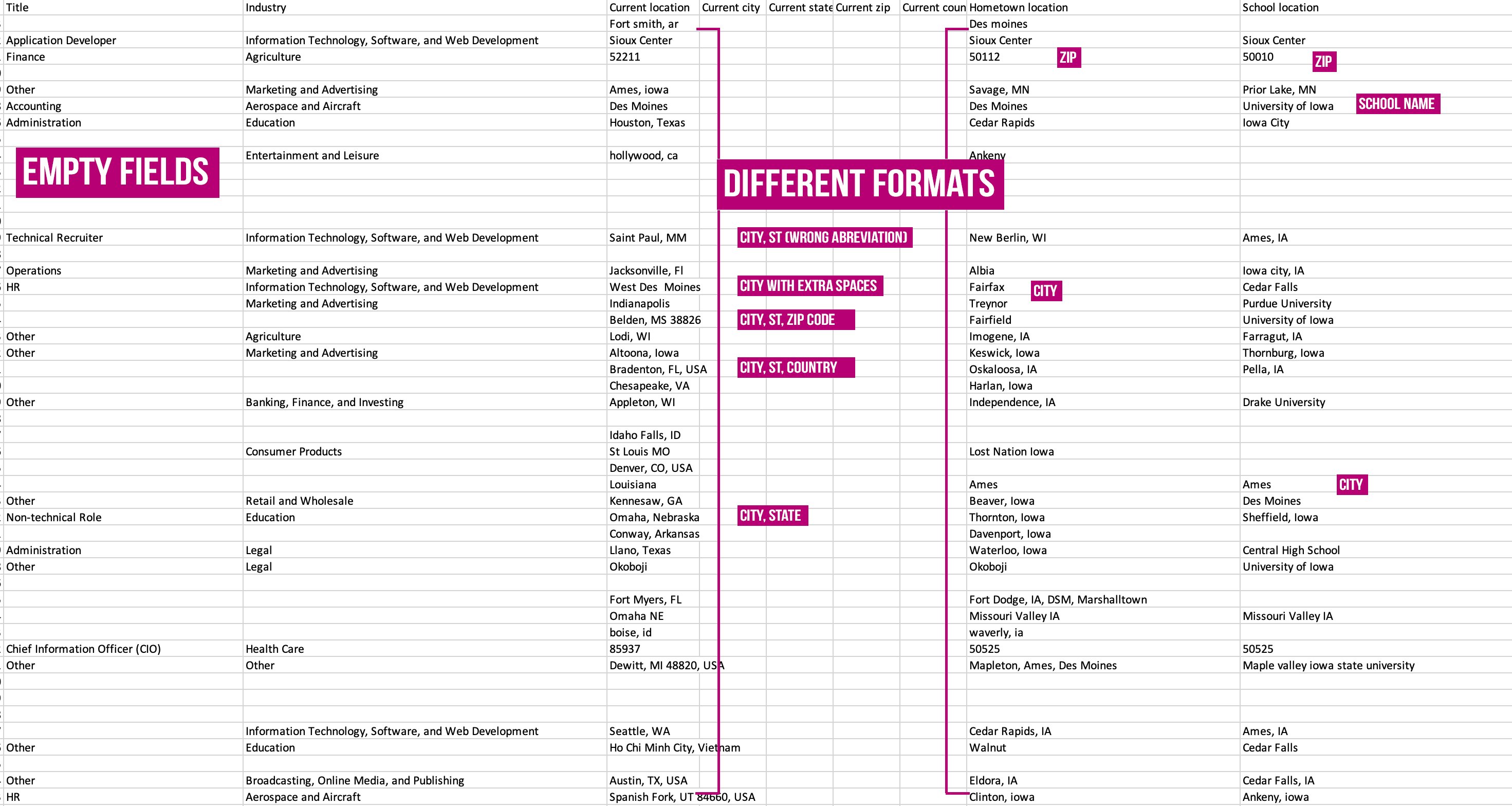
You got that right, another Jay Z-ish reference to set the tone with how dope data can really be. If you have a clear form, when you export or view the data you should see clean filterable, sortable data. Here's why this is so important! This week, Bri and I were diving into a database to see how the demographic data from people who filled out the form compared to people we reached with Facebook. We wanted to find where they live, their age and gender.
Here was the problem. These fields WERE on the form but they were not required and completely text field write ins. Here's the difference. See how tough it would be to filter the data below? You'd have to spend hours cleaning it up and making it consistent before you could really quantify it. The formats are all different.
A great lead gen form can give your business so many opportunities. It doesn't matter how small your marketing team is. Setting up your forms correctly will give you the data you need to
- communicate directly to people who are already engaged in your brand. Live chat, email, texting, phone.
- launch an automated marketing strategy
- upload the list and use in advertising targeting
- find twins of these people and target them with advertising
- execute research and publish a case study
- engage with participants for influencer, guest content spots, or evangelist opportunities
- so so so many more things that I can't even type because I'm drooling too much over the possibilities.
How Can You Fix Your Form Fields?
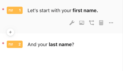
Don't use a full name box. Split first name and last name into separate short text boxes. Why? Because personalization will take your marketing to the next level and it takes a TON of time to re-validate your data to pull out their first name.
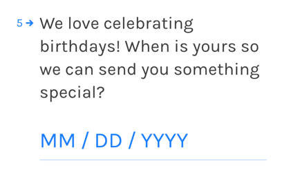
Don't let users write in their birthday in a short text field. Use date formatting for consistency.
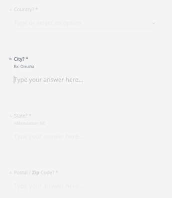
Location collection can be tricky. The best way to go about this is by providing drop downs for Country, State, and City with a number field for the zip code. I realize this means you have to upload a ton of information. If you want a short cut, put a dropdown for the country, short text for state and city with format suggestion and validation, and finally a zip code number box.
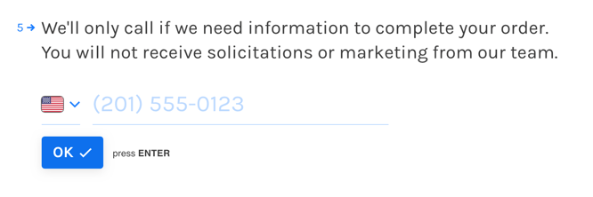
Don't let users format their own phone numbers. Use a phone formatted box that allows user to choose their country and automatically formats the submitted data the same.
Nuthin' But A G Thang. (Or A Best Practice Thang)
Let's take a break from Jay and add a nod to Dre. These easy best practices should be your form development blueprint. It's like this and like that and like this... 👇
- Your form should be able to be EASILY completed on a mobile phone.
- Make all fields required (if it's not important to you, don't ask it).
- Arrange questions from easiest to hardest.
- Use form field validation. If someone types in an email without an @ sign, it should render an error with positive, catchy copy)
- Align text to the left of your form. This makes it easy to complete and is a true god send on data validation on the back end.
- Use auto-fill capabilities so users devices can enter based on their own settings.
- Use reCAPTCHA, not CAPTCHA. It detects SPAM better and has better security measure.
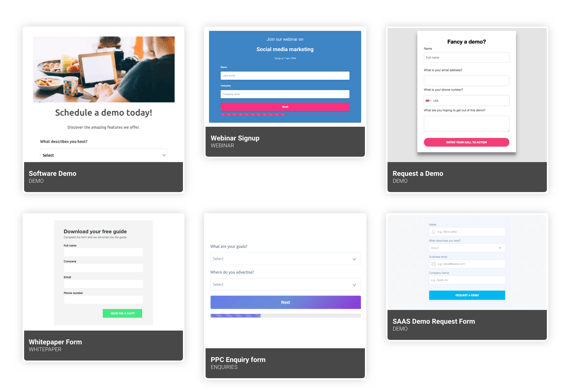
General Design: Keep It Simple
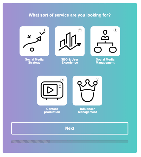
Forms with multiple steps can help walk your audience through completion within a super slick and simple process. These style of forms seem a lot less overwhelming. The progress bar provides both an encouragement and a sense of accomplishment. You can also "hide" more sensitive questions like email address and phone number in the final steps. Most people won't want to give up on the entire form because they've already made the commitment.
When in doubt, find a tool to help you out?
If you don't have someone on your team who can build the proper form on your site or in social, find a tool to do it for you. These are my two favorites.
-
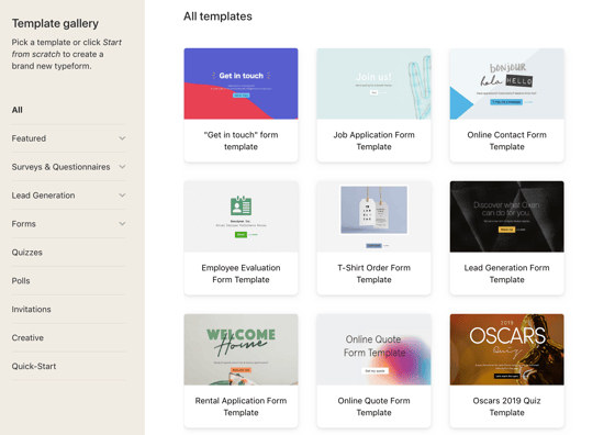
Typeform is my absolutely favorite! They have really amazing looking templates to start from. The designs are both aesthetically appealing and super easy to use. PLUS, these forms can pretty much be embedded or linked anywhere! You can do some pretty awesome stuff with the free version but the Pro package is where it's at!
-
Leadformly is a really simple tool that has some streamlined integrations. It's a little bit more spendy but their multi-step templates are awesome. They even connect directly with your Salesforce, HubSpot, Mailchimp or can connect to a ton of tools via Zapier.